Mobile App Redesign
Team: Product Manager, Engineering Manager, Mobile Developers, QA Engineers, UX Researcher
I redesigned ChargePoint's consumer mobile app with three goals in mind: streamlining mobile components, improving usability, and meeting WCAG accessibility standards.
Problem Scope
The app had not seen a major design update since 2015. The app experience was inconsistent, with some sections styled with an older visual design. Developers were rewriting components and pages with each feature update, despite versions of them already existing somewhere in the app.
The app had a structure and layout that was not aligned with user research nor usage data. The entire EV charging industry and EV drivers had changed and the app was not reflective of that. It needed to be redesigned to better serve actual driver needs.
Improving accessibility and meeting WCAG standards was also a major company-wide goal. Our app had never been designed with accessibility in mind; the color palette had major contrast issues and many interaction patterns were challenging for both disabled and able bodied drivers.
Research
I had recently completed a diary and qualitative interview study with drivers from the EU and US to better understand how drivers charge, look for charging stations, and compare stations. I observed drivers demonstrating how they typically find charging stations and completing brief tasks on the Chargepoint app. Some were every day users for our app, other drivers rarely used it.
I also reviewed usage data from Mixpanel and reviews from the App Store for more data points, building a more complete picture of driver behavior and pain points.
I summarized the research findings into principles, in no particular order, to guide the redesign:
- Drivers tend to visit the same chargers Drivers charge at the same few chargers for a variety of reasons. Some stick to routine and visit the same few places; for others, they know which chargers works for them and their car. Because drivers are sensitive to EV range limits, they do not frequently find themselves in an unfamiliar area needing a charger.
- Search is not the main priority for all drivers Because drivers tend to frequent the same stations, drivers are not necessarily frequently searching for stations on our app. Drivers with company vehicles, common in the EU, will have more administrative tasks to complete, such as submitting charging history for reimbursement on a monthly basis. Home charger owners tend to use the app to set charging schedules and manage charger settings.
- Drivers are not familiar with charging terminology There is a lot of jargon associated with EV charging. Stations can be referred to as Level 1, 2, and 3. NACS, J1772, Combo, CCS, and Type 2 are some common connectors. Charging is sometimes described in kilowatt hours, sometimes kilowatts. Dealership and car rental employees aren’t trained to educate drivers and sometimes even experienced drivers can have difficulty understanding EV terminology.
- Drivers will try to minimize risk when selecting a station. All drivers I spoke were able to recall a time they drove to a charger and could not charge because the station was broken or incompatible with their vehicle. This is especially frustrating because of range limitations and the time intensive nature of charging. Down stations need to be labelled accurately and station compatibility should be simple to understand. Drivers frequently prefer areas with more chargers, in case one is broken.
Explorations
Usability
Landing Page
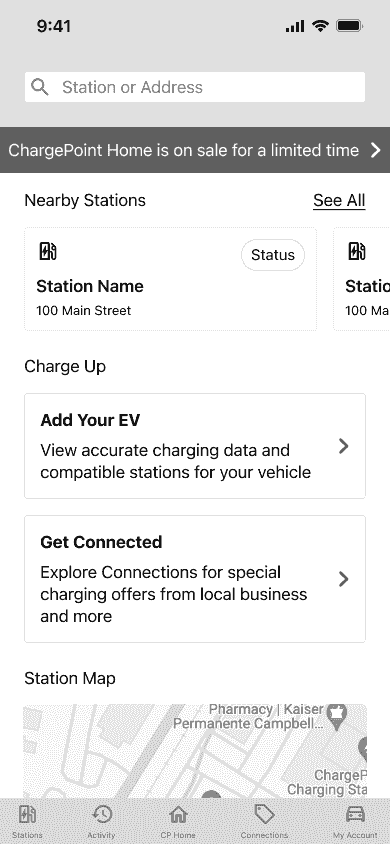
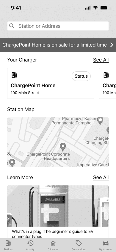
I proposed showing a personalized landing page, instead of a generic map, upon open. User data suggested finding stations wasn't the main reason drivers were coming to the app. Drivers would be segmented and have different views based on their profile: new EV drivers, home charger owners, workplace chargers to name a few. Drivers would be shown content and features that actually fit there needs. Home charger owners will be more interested in setting their charging schedule than looking for a station. A driver renting an EV for the first time will need more help with learning how to charge.
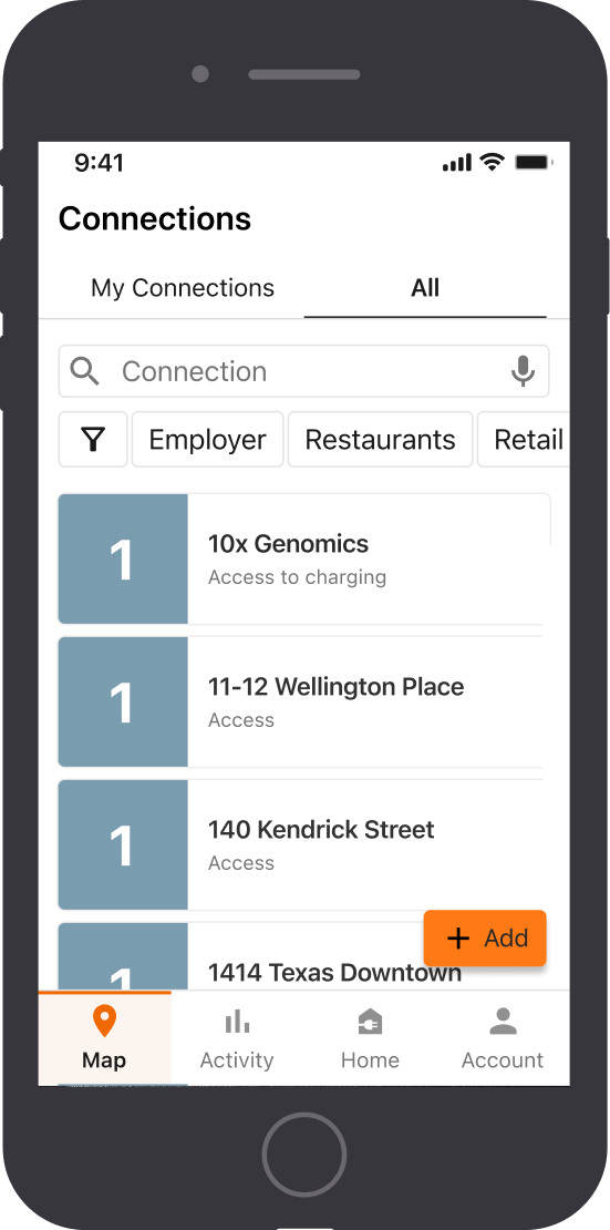
My Spots and Recents
My Spots and Recents had higher than expected traffic for being pages buried behind a hamburger menu. Drivers also tend to revisit the same stations, so I wanted to move those two pages out of the hamburger menu and integrate it into the map view. I explored a few treatments, such as tabs, a floating action button, or filter attributes.
Reusable Components
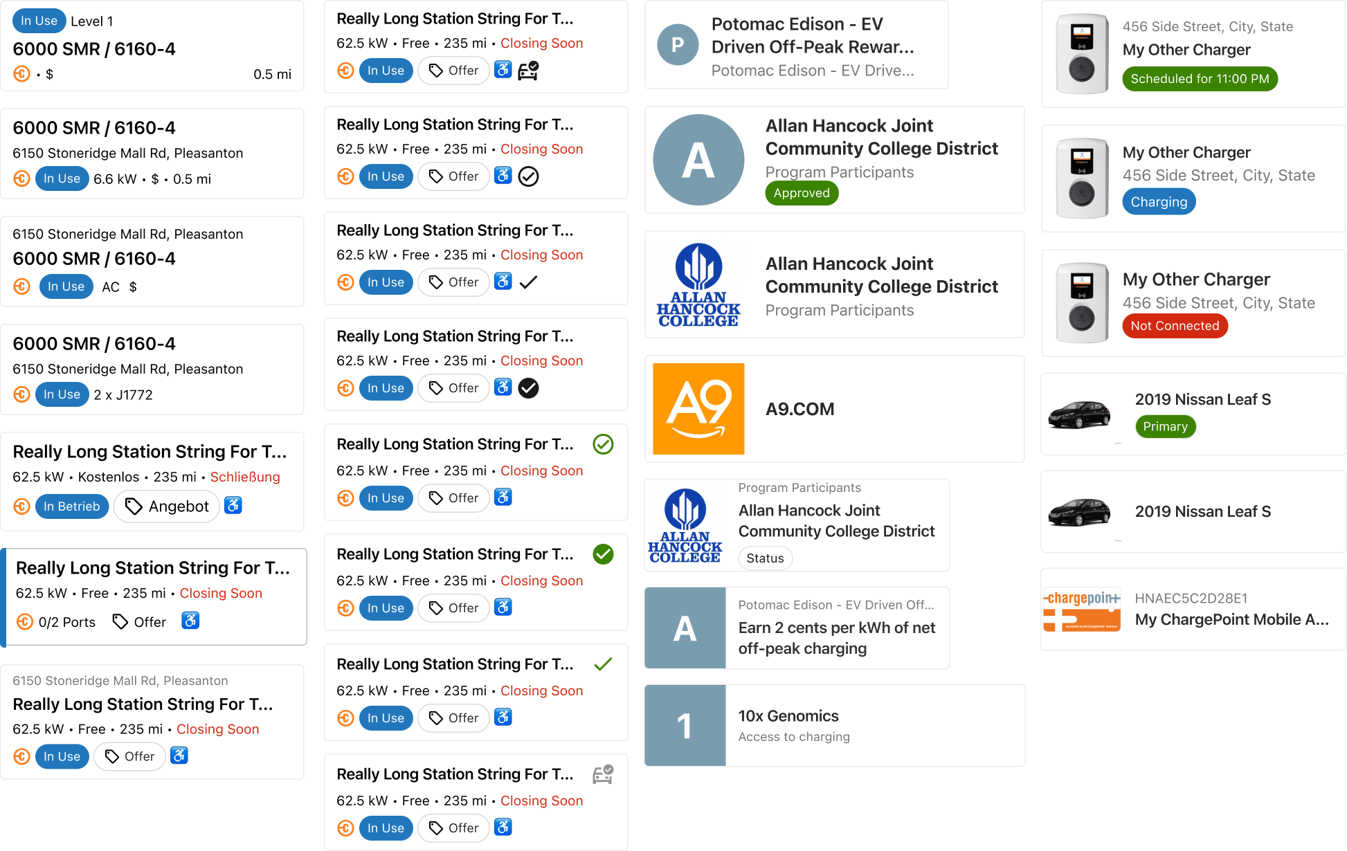
Where possible, I reused and streamlined components. For example, tappable cards were used throughout the app for various applications, representing stations, connection offers, and saved locations. I wanted a generic enough design that could be easily modified to accommodate different attributes and information density.
Accessibility

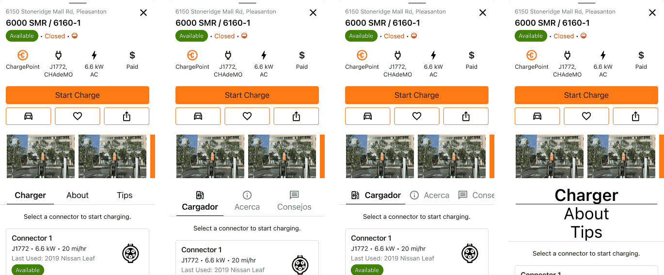
I wanted to introduce tab navigation throughout the app to better manage information density. Certain pages, such as the station details view, are rather long, which can already be annoying for able bodied users to parse through. For users that rely on screen readers, this can be even more irritating.
I explored using iconography, horizontal scroll, and vertical stacking to accommodate longer strings, localization, and expanded font sizes.
Resolution
I designed primarily using iOS components as Apple had reached out and offered a design review to help evaluate our component usage and accessibility. Focusing on iOS also helped reduce the amount of design development time. I held reviews with iOS and Android developers to ensure equivalent components existed within Material Design. If a component required excessive effort from the Android team, we would try to find a middle ground between the two systems.
I also focused on building for smaller screen sizes (iPhone SE) to ensure relevant and important information would be available above the fold. This was also done in part to support more accessibile development; using larger font sizes tends to stretch out content on the vertical axis so less content is visible without scrolling.
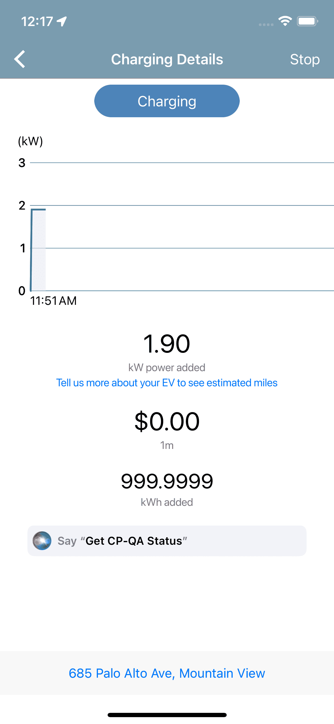
Our first release of the new 6.0 version included updated navigation, map view, charging details, and station details sheet.
Usability
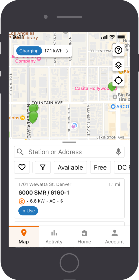
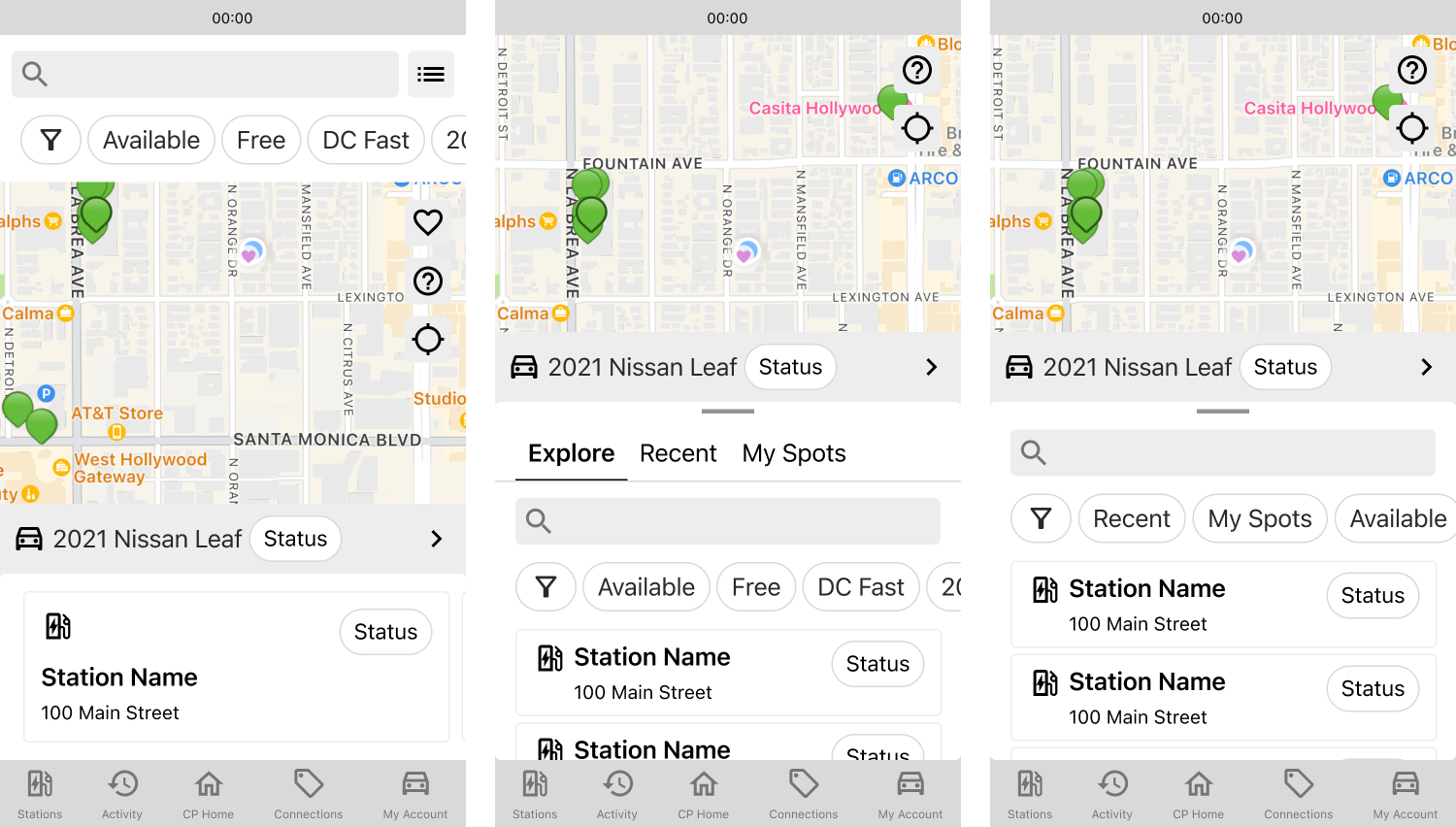
Integrated Map and List View
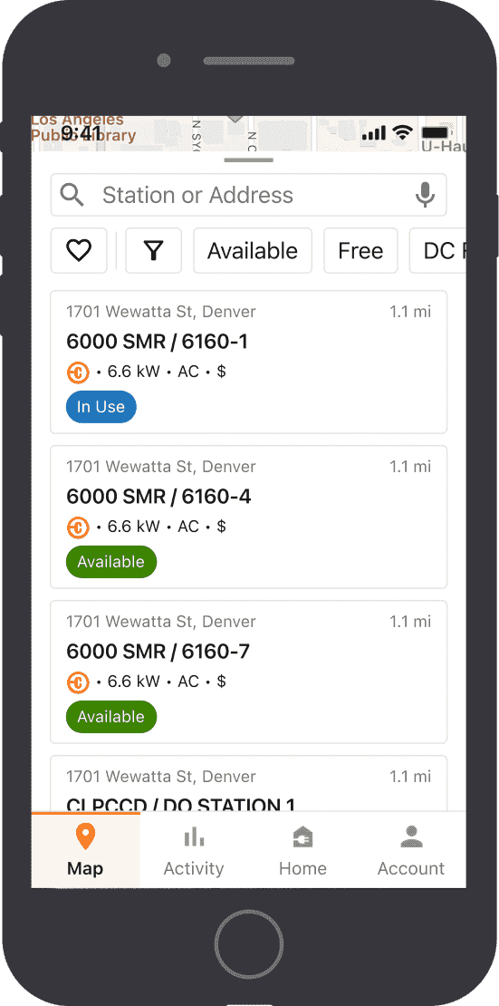
I integrated the map and list view, as the latter was a popular view that was behind an overflow menu. While the map view is useful for understanding a station’s geographic location relative to your own location or a point of interest, the list view is better for quickly evaluating and comparing different stations’s attributes, which are relevant to understanding station compatibility. Attributes that drivers care about, like speed and proximity, are visible from the list. Exposed filters also allow driver to find suitable stations faster. Main actions are clustered in the lower half of the screen for better accessibility.
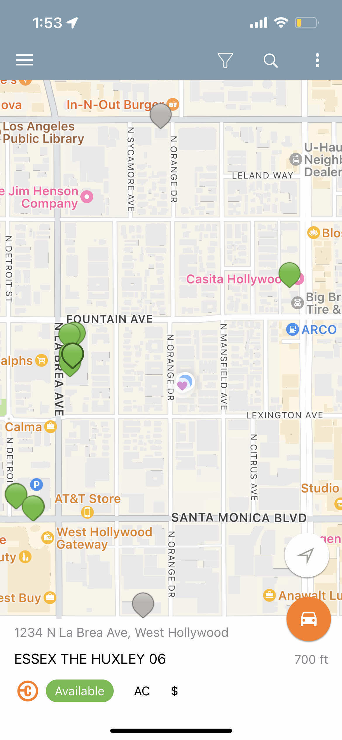
Map Key
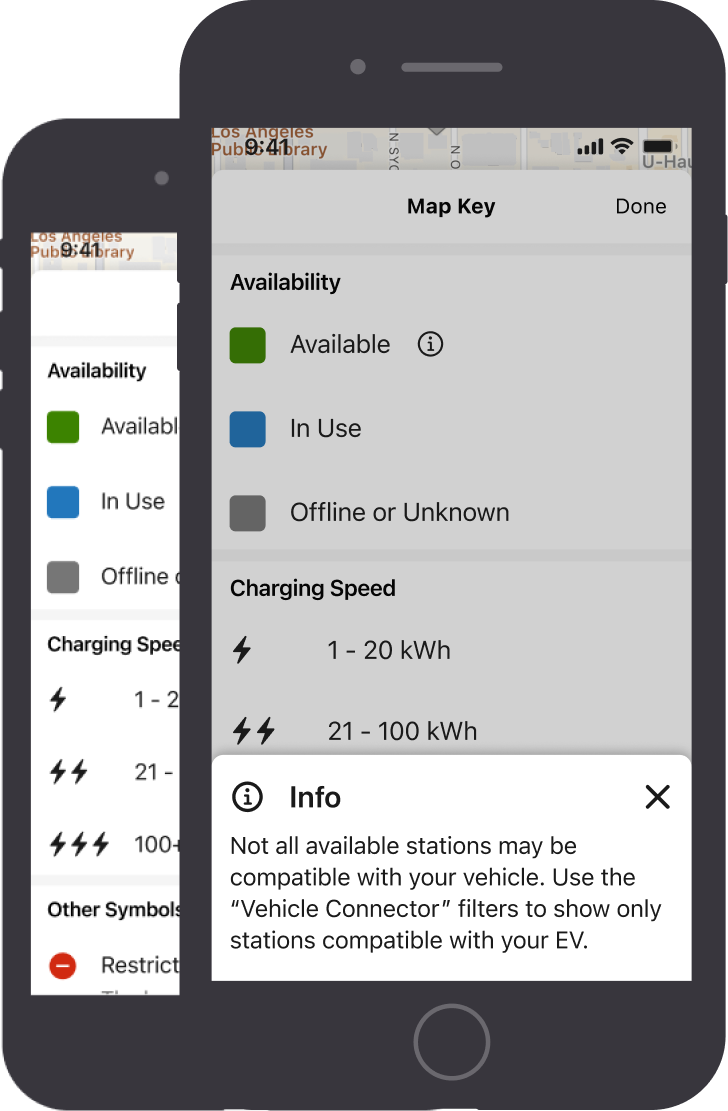
The map key educates drivers on the visual language of our pins, as different apps and localities often have different meanings for colors (e.g. many UK apps use color to denote station speed). This prevents drivers from making wrong assumptions about stations, as we saw in user studies.
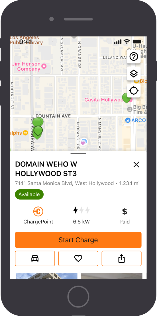
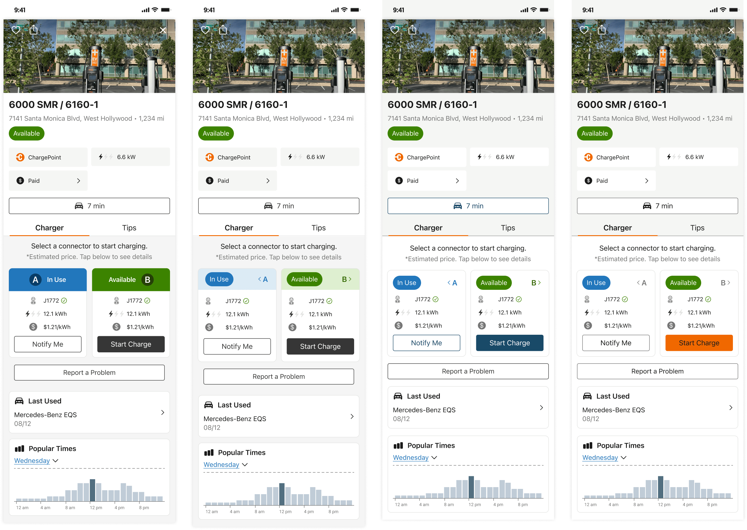
Station Details
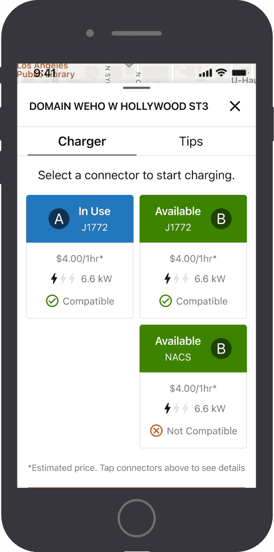
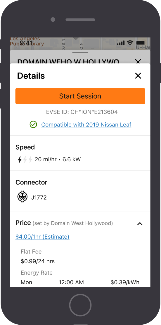
The new station half sheet features relevant station attributes and actions to get drivers to where they need to go faster. Speed is represented as lightening bolts and kilowatts to accomodate novice and advanced drivers.
A compatibility label reduces the mental load for drivers and ensures they will able to charge at the station. Stations with multiple connectors have side "A" and "B" labels, which correspond with the station's on screen graphics, ensuring a consistent experience across platforms.
Accessibility
Bottom Navigation
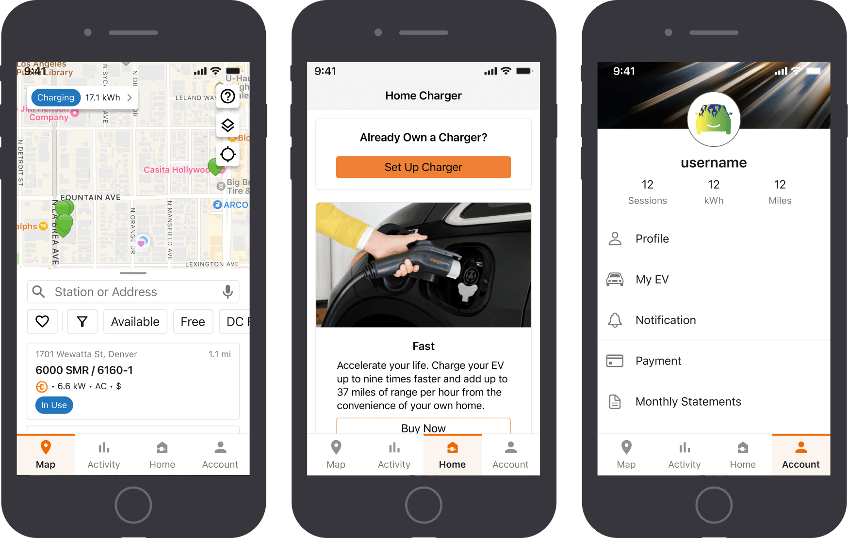
A bottom navigation bar replaced the hamburger menu, as it works with assisitve technologies and improves feature discoverability and accessibility. For example, exposing "Home" allows home charger owners to more easil access the features they need and introduce those without a home charger to more of our hardware ecosystem.
Tab Navigation
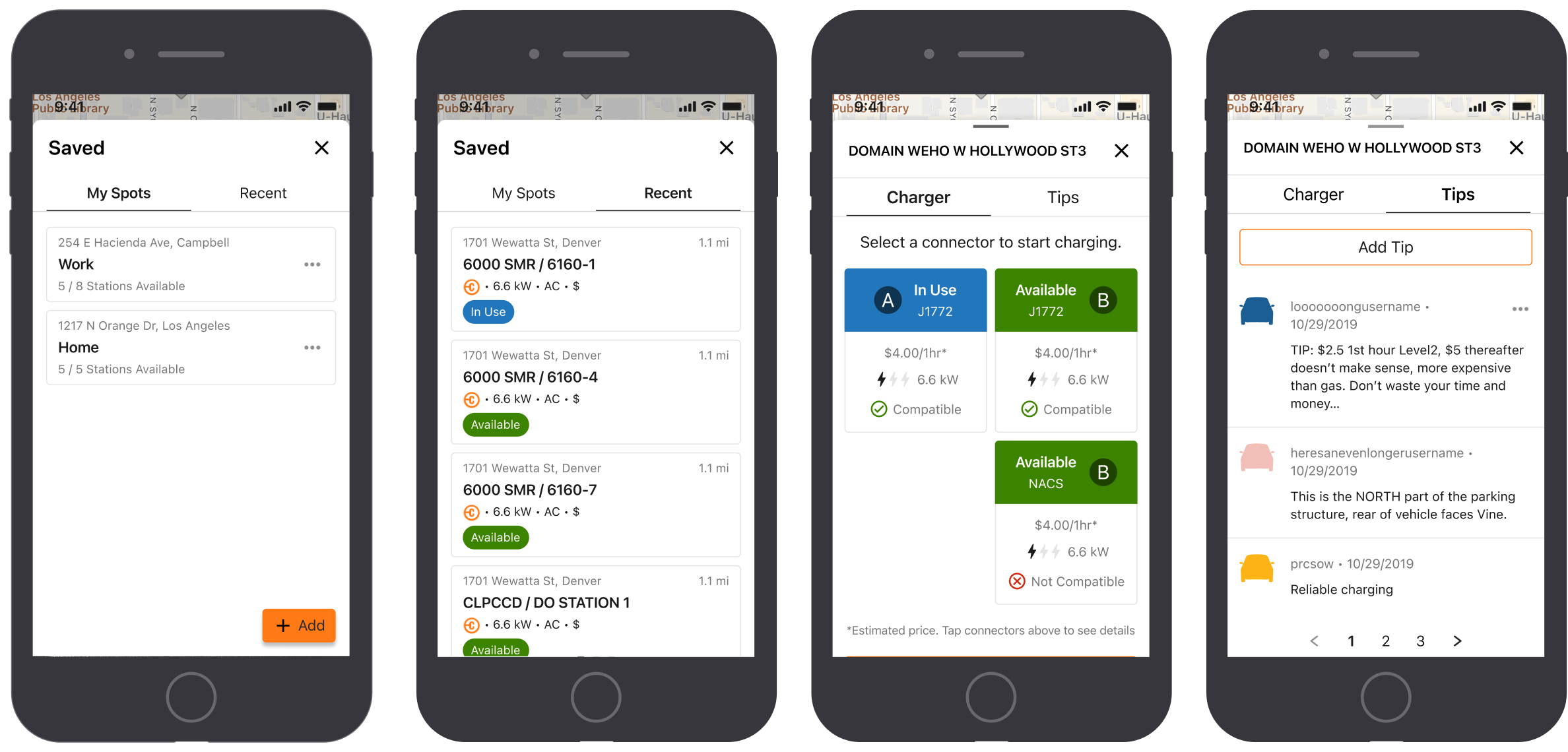
The two tab navigation provides drivers quicker access to the information they need and works with longer strings from localization or expanded font sizes associated with native mobile accessibility features.
Updated Color Palette
I applied a color palette, developed in collaboration with a visual designer, to ensure all components are accessible, moving away from the gray blue found in older versions of our app.
Interaction Demos
Future Considerations
We had our first release in November 2023, after six months of design and development. Our goals were to make progress on app accessibility and UX improvements for our drivers. As many parts of the app had to be rewritten, the entire app couldn’t be addressed with the first release. Resourcing constraints were another issue; backend and API developers were tied up in other projects, so some major changes had to be pushed further down the roadmap.
Map Pins & Ontology
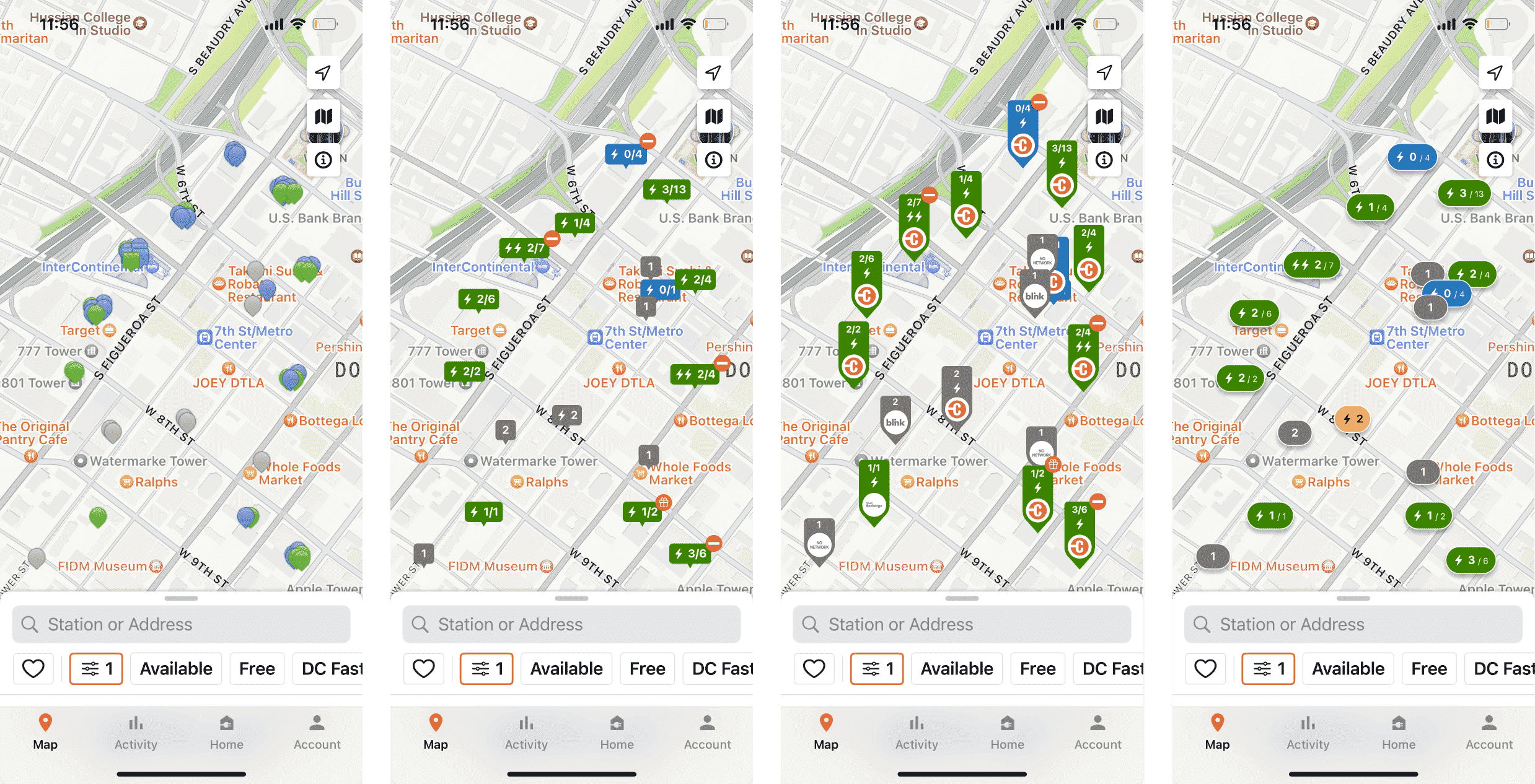
In research sessions, we asked drivers what they thought the colors and shapes represented. While some attributes were fairly intuitive, others were unclear and drivers were left to make assumptions. Confusion around map pins was something that I would have liked to further work on. A pin key was an okay first step, but does not address the core issue.
Additionally, pins frequently overlap on the map in high density locations, like urban downtowns or parking garages. Pins have to be manually geotagged to resolve the overlap.
With the help of a design researcher, we tested different pin treatments and exposing different station attributes. To resolve excessive overlap, we consolidated individual station pins into site pins. This also allows drivers to better gauge their chances of getting an available a station. We also tried showing charger speed, network, access control, and promotional offers on this map view.
On top of the overlap issue, switching from a station based map to a site based map allows for better data attribution. For example, amenities, access restrictions, and hours are better assigned at a site level than station level.
Driver Education & Personalization
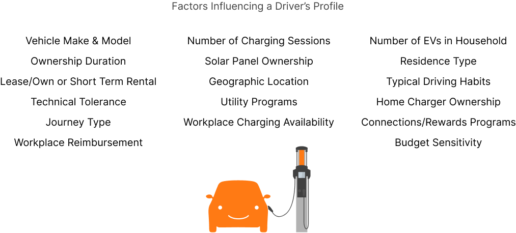
Today, drivers are not meaningfully segmented into persona groups. We can extrapolate attributes from data we have today, such as number of charging sessions, “connection” offer participation, account type (work vs. personal), and home charger ownership.
Assigning driver personas to users would allow us to deliver a personalized and best in class experience to keep drivers in our ecosystem. Content and driver education needs to be relevant to the driver's needs and delivered the at the appropriate time for greatest efficacy. The needs of a first time driver renting an EV on vacation are going to differ from an veteran driver on their second EV that charges at their workplace.
Further Visual Development
To meet the our deadlines, I limited my visual explorations. I would have liked to explore more applications of our brand palette, whether it be reducing our reliance on orange or introducing more blacks and grays to balance the brand palette more. Using orange as the primary color in the palette is a bit unbalanced and garish, though it reinforces the brand. I also explored some blockier layouts to create more differentiation between the foreground and background to improve legibility.