Data Entry Tool Refactor
Team: Project Manager, Full Stack Engineer (Client)
I was tasked with reducing time spent on data entry for the sales team of a waste management company. The interface redesign resulted in an 80% decrease in data entry time.
Problem Scope
The client needed to increase the volume of calls their sales staff were making. Data entry, while part of the sales process, was taking time away from calling. Managers were being pulled away from primary responsibilities to evaluate data accuracy. My team, initially comprised of an engineer and engagement manager, was tasked with simplifying the process of entering invoicing bills into their internal software. They began to investigate the possibility of automating the process using optical character recognition (OCR) and I was asked to create the validation interface.
Research
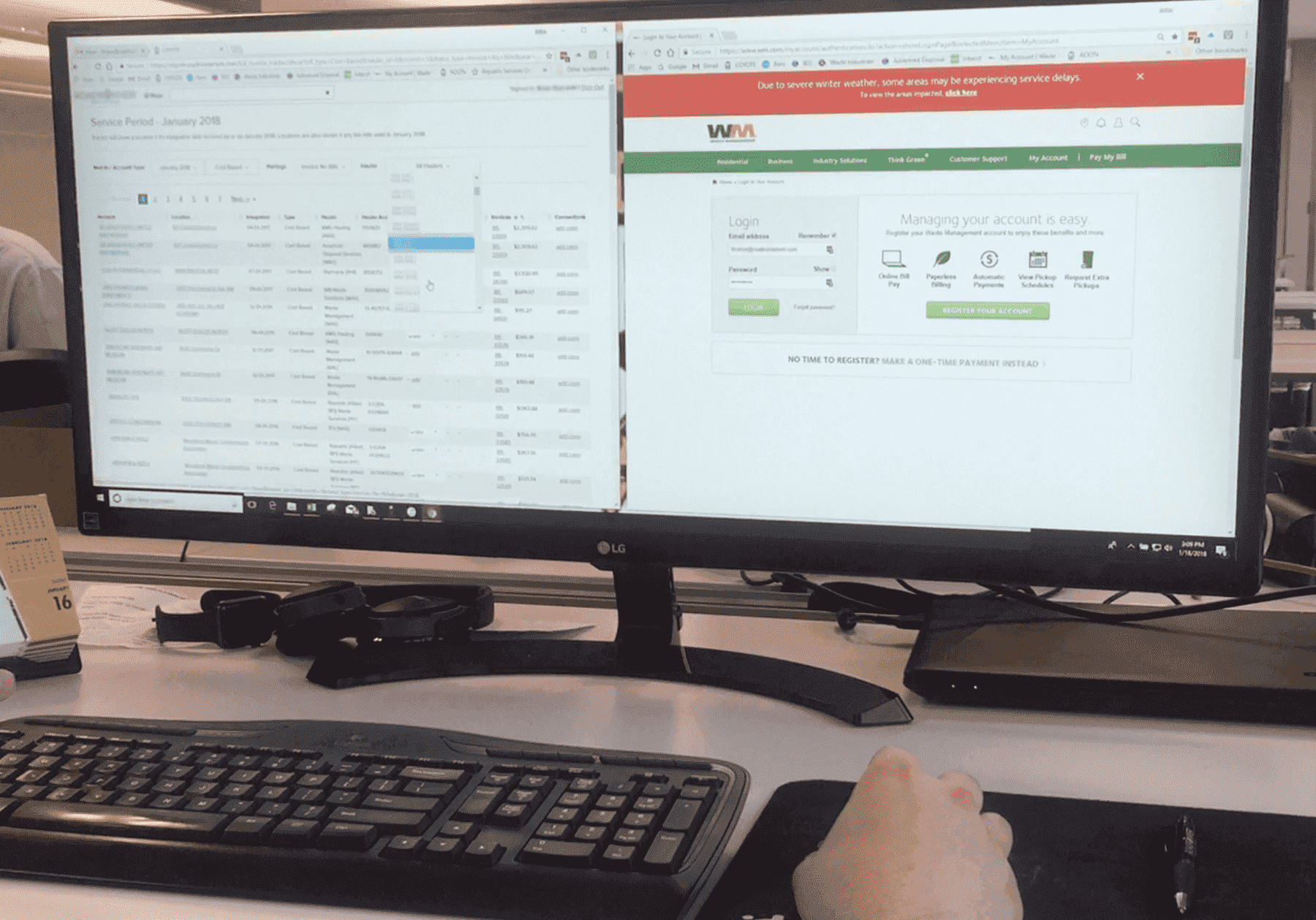
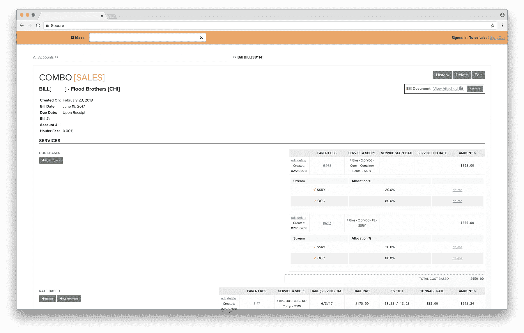
I started reviewing internal training documents and research previously conducted by my team. However, our research was based on a demo of the data entry software presented by the head of operations. He was an expert user and did not represent the typical sales staff member.
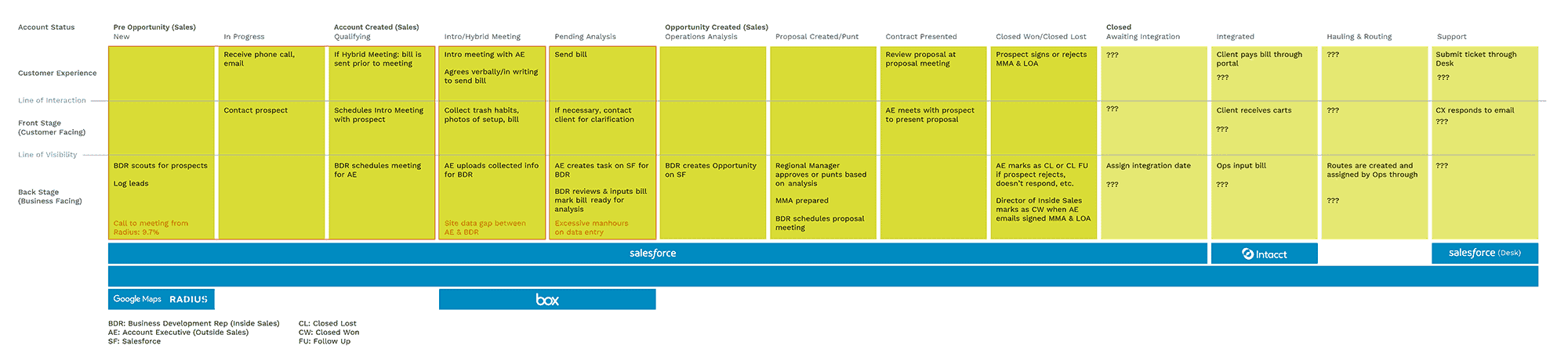
To understand why data entry was difficult and time consuming, I conducted observational sessions and ride alongs with the inside sales, outside sales, and finance teams, as well as unstructured interviews with sales and operations leadership. These teams regularly used or collected data for data entry. The service blueprint below outlines the entire sales journey and allowed us to indentify and discuss inefficiencies throughout the entire sales process.
Spending time with the end users enabled me to observe actual, and sometimes unexpected, behavior. I noticed top sales staff had their desks covered with papers. They would sometimes “preprocess” bills; before entering a bill into the system, they would annotate a paper copy because the order of items on the bills didn’t match the workflow dictated by the software. A UI refactor could solve this disconnect, improve data accuracy, task completion times, and perceived task difficulty, and be implemented faster than an OCR solution. I then audited the software to identify inconsistent language, component usage, and interaction patterns. I also built modified keystroke level models to quantify inefficiencies and recurring patterns of use.

Exploration
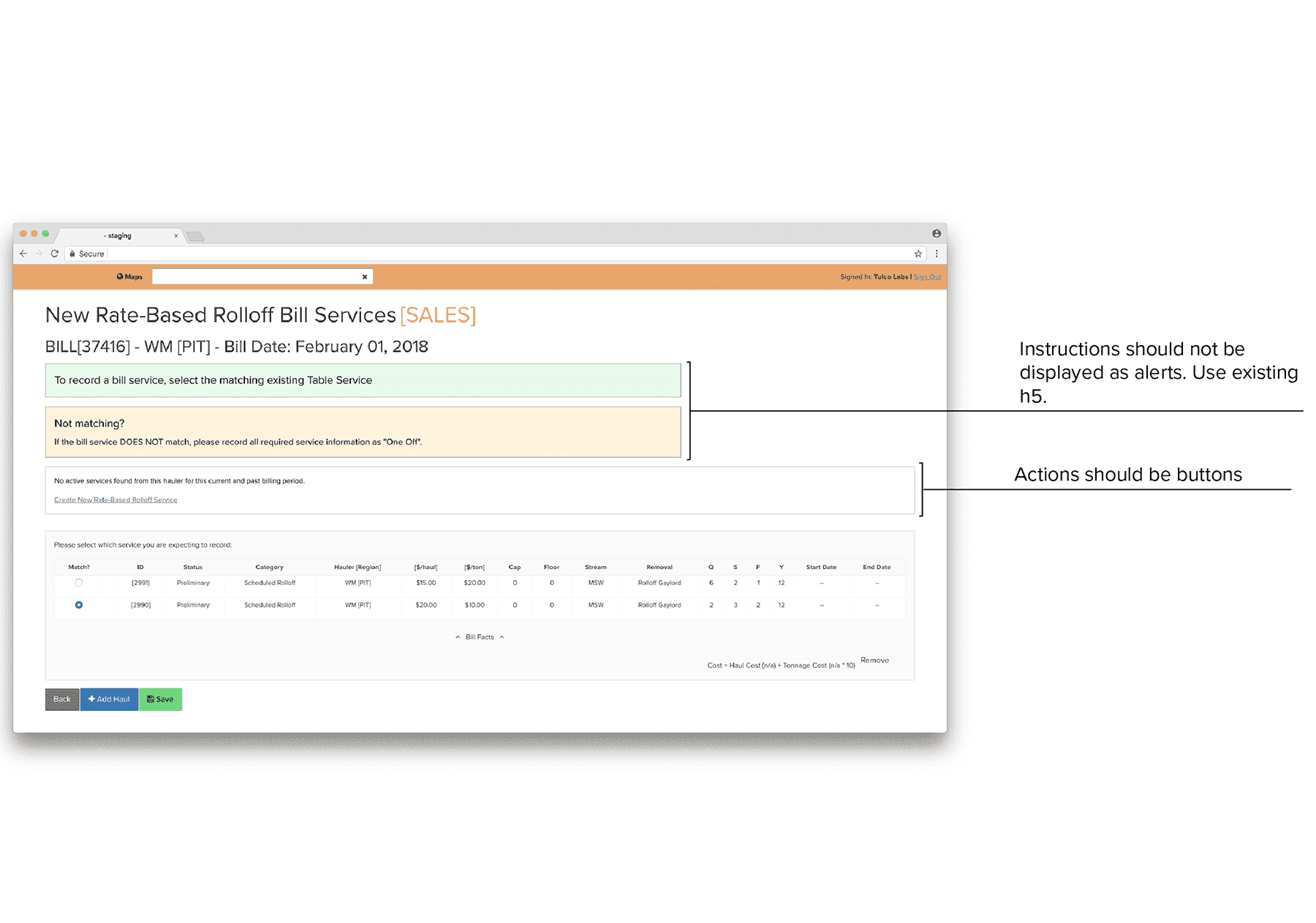
After getting client buy in, I wireframed some potential redesigns. I clustered similar actions to the top of the page, reducing scrolling and eliminating an implied chronology to better reflect the bills being entered.
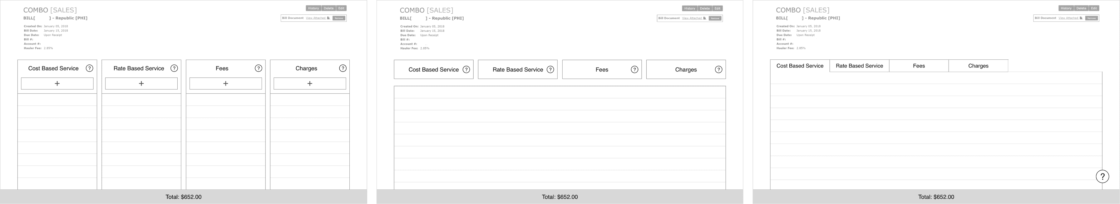
I kept changes minimal to allow for rapid implementation. With direction by the client's engineering team, I used Ant Design components to build out a usage guide based on their needs, ensuring a consistent design language.
The process for adding line items was adjusted to allow users to add multiple items of the same category, instead of adding each charge one by one.
I tested the rearranged buttons and simplified adding process by having sales staff of different experience levels enter a mock bill through a clickable prototype. Users reported improved perceived task difficulty.
Resolution
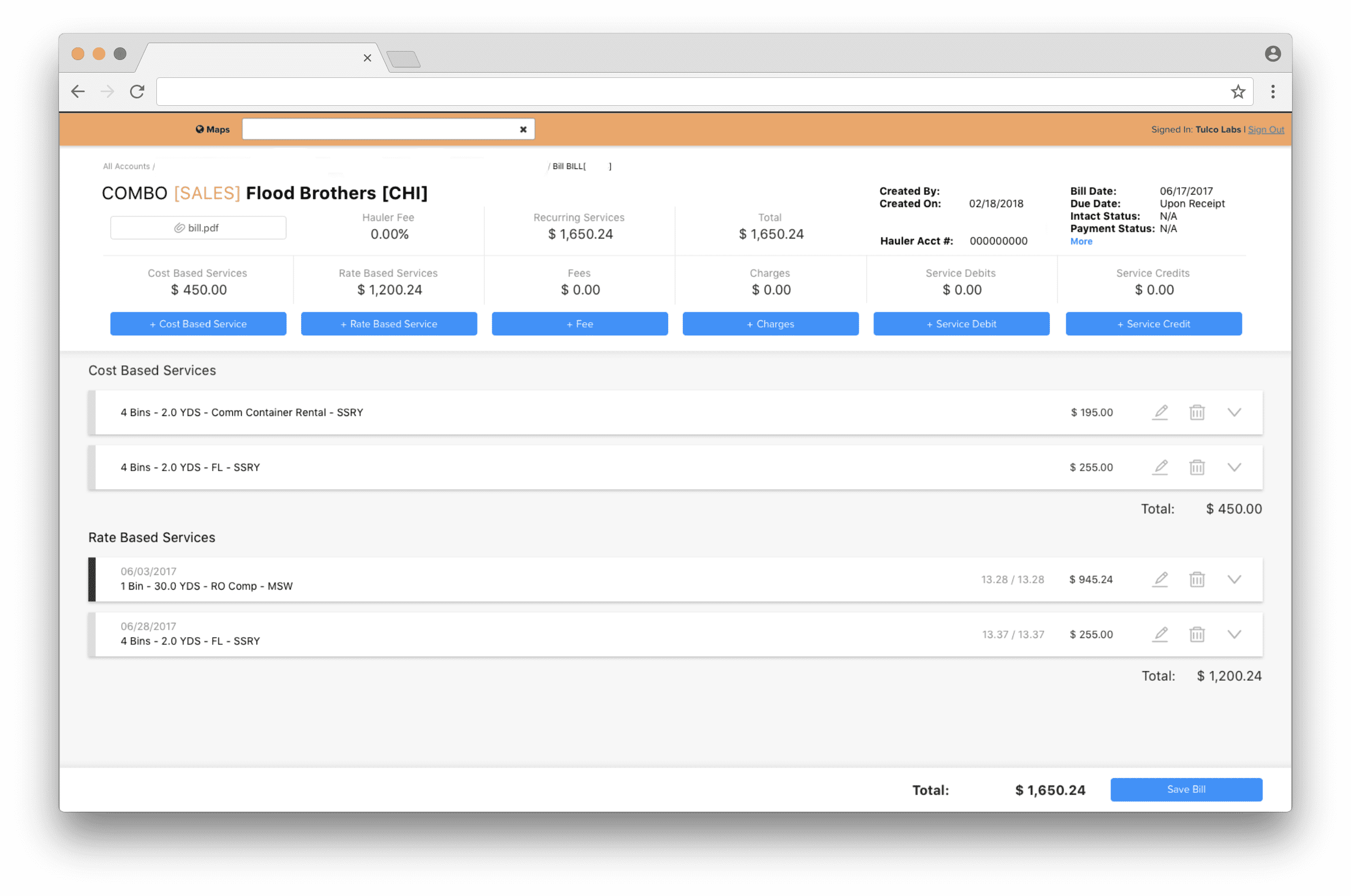
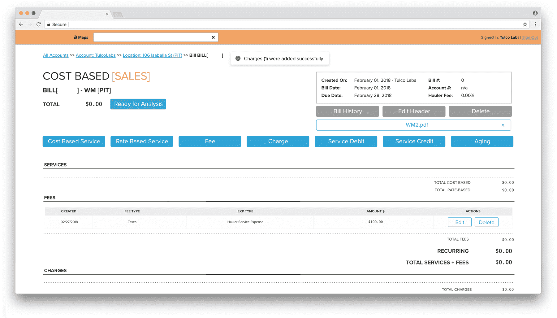
After seeing the prototype and early test results, the client wanted a more drastic redesign. For the second round, I was focused on limiting interactions to a single page (no page redirects) to create a more streamlined experience. I moved away from tables and displayed line items as “cards” rather than tables to improve legibility and reduce extraneous information. Key metrics were added to the top of the page to allow managers to quickly check input accuracy and identify where errors lie.
I delivered a component guide and videos detailing interactions and continued working with their front end developer to ensure a smooth delivery.


The entire process, including deployment, took about six months. According to client feedback, the redesigned interface decreased data entry time by 80%.
Considerations
Spending time with users in their space ensured the project’s success. Glancing over the software the first time, it was obvious there were some basic UI best practices that could improve the experience, but really spending time with users was what highlighted the core problems.
I would have loved to conduct more quantitative testing to compare task completion time, as well as seeing how the tool could be improved for the operations team. An OCR solution is still compelling and would be interesting to design, but the amount of work it would require from a technological standpoint made it unrealistic.